
UI Kit
Colores
primary-color
#FF0000
primary-color: hover
#FF8201
primary-complement
#FFBC42
black-color
#111111
dark
#A0A3A
dark-ligth
#E7E7E7
white-color
#FEFDFA
complement-color
#a8ff02
complement-color: hover
#b2ffa9
Botones
Iconos
Badge
Badge
Badge
Badge
Badge
Enlaces
Este es un enlace : ui-kitTipografías
H1
Barlow Semi Condensed
46px (2.875 rem)
H2
Barlow Semi Condensed
38px (2.375 rem)
H3
Barlow Semi Condensed
24px (1.5 rem)
H4
Barlow Semi Condensed
22px (1.375 rem)
H5
Barlow Semi Condensed
18px (1.125 rem)
Párrafo
Barlow Regular
16px (1 rem)
Párrafo itálico
Barlow Italic
16px (1 rem)
Small
Barlow Italic
12px (0.75 rem)
Componentes
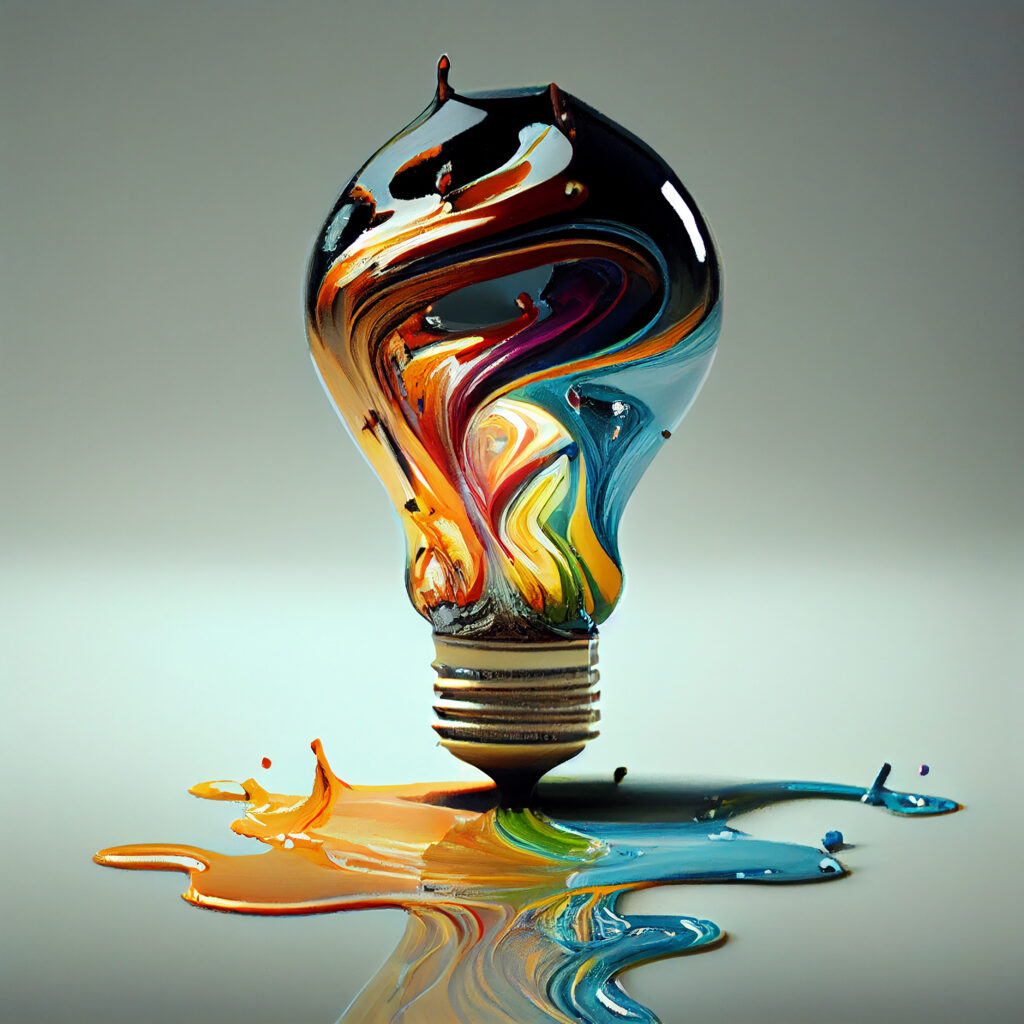
Lorem Ipsum
Lorem ipsum is placeholder text commonly used in the graphic, print, and publishing industries for previewing layouts and visual mockups.
Lorem Ipsum
Lorem ipsum is placeholder text commonly used in the graphic, print, and publishing industries for previewing layouts and visual mockups.
Lorem Ipsum
Lorem ipsum is placeholder text commonly used in the graphic, print, and publishing industries for previewing layouts and visual mockups.